What the Precinct Data Got Right,
What It Revealed, and What It Means
for the Next One
Precinct-level targeting for a 2026 Bay Area healthcare sales tax. The tiers sorted in perfect rank order. The measure lost at 43%. Here’s what the data tells us about why.
down 15pp from prior measure
lowest of any tier
higher than affluent blue
1 · The targeting model held — the electorate didn’t
A Bay Area county put a healthcare sales tax on the ballot in 2026. The measure had history on its side — a nearly identical measure had passed with 58.5% six years earlier. VoterForce provided precinct-level targeting: 558 precincts classified into four campaign tiers using the prior measure’s actual results, cross-referenced with a statewide reform proposition, Medi-Cal enrollment, ACS workforce data, and the 2024 voter file.
The measure lost at 43%. But on election night, the four tiers sorted in perfect rank order.
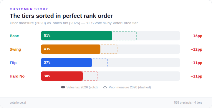
The precincts VoterForce identified as most supportive were most supportive. Base, Swing, Flip, Hard No — every tier performed exactly where the model predicted, in order. The targeting was right.
But support collapsed everywhere. Every tier dropped 11–18 points from the prior measure. Base precincts — which voted 69% YES on an identical measure type six years earlier — came in at 51%. This wasn’t a targeting failure. The political environment for a sales tax in 2026 was fundamentally different.
2 · The turnout was inverted
The most actionable finding from the post-election analysis: the campaign’s strongest precincts had the lowest turnout, and the opposition’s strongest had the highest.
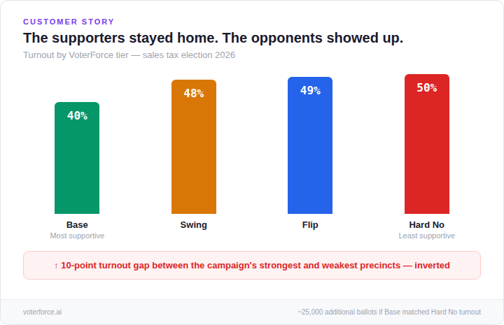
If Base precincts had matched Hard No turnout, that’s roughly 25,000 additional ballots cast in the most favorable precincts. That alone wouldn’t have closed a 14-point gap — but it would have changed the margin by several points, and it was identifiable in the data before election day.
The 40% turnout in Base precincts wasn’t a late-breaking problem — it was a structural one. The voters who benefit most from public services are the hardest to turn out. That requires sustained contact starting months before the election, not a last-week GOTV push.
3 · Benefit recipients crossed partisan lines — and partisan targeting missed them
VoterForce tested whether partisanship or benefit enrollment was the better predictor of support. The answer: both matter independently, but the combination reveals a voter segment that standard partisan targeting misses entirely.
Partisanship had the wider raw spread — 25 points between the bluest and reddest precincts. But when you hold partisanship constant and vary income, something striking emerges: among precincts with the same partisan lean, low-income precincts voted nearly 10 points higher on the prior healthcare measure than high-income precincts.
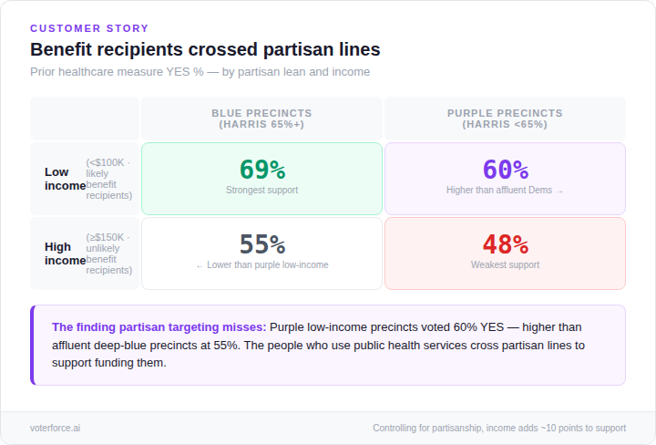
Purple precincts with high benefit enrollment — the ones that lean moderate politically but have significant Medi-Cal and SNAP participation — voted 60% YES on the prior measure. That’s higher than affluent deep-blue precincts at 55%. The people who use public health services cross partisan lines to support funding them.
A campaign running standard partisan targeting would have deprioritized those purple, low-income precincts. VoterForce’s model flagged them as persuadable. They were.
What this means for the next sales tax
The biggest Bay Area sales tax measure in a generation is heading to voters in November 2026. The Connect Bay Area transit measure would add a half-cent sales tax across five counties — including the same county where this healthcare measure just failed — to prevent service cuts at BART, Muni, Caltrain, and AC Transit. It needs 50%+1. Recent polling shows 56% support. That’s a 6-point cushion. The healthcare measure polled well above 50% too.
The 40% turnout in Base precincts was a structural problem, not a tactical one. The voters who benefit most from public services are the hardest to turn out. The precinct-level data can identify exactly where those voters are now.
Low-income moderate precincts are persuadable on public service funding — but not with the same message that works in deep-blue base precincts. For a transit measure, these are the riders. The precinct data can find them.
The statewide reform proposition passed at 71% in this county — 13 points higher than the prior measure. Reform appetite on a no-cost proposition didn’t translate to willingness to pay a sales tax. Directionally useful for identifying persuadable precincts, but not predictive of actual vote share.
VoterForce maps this electorate at the precinct level.
We identify, segment, and make reachable the specific voter communities that decide outcomes. If you’re working on Connect Bay Area or any California ballot measure, the precinct data for your county is ready to build.
Get in touch →Methodology & Sources
This analysis draws on precinct-level targeting VoterForce provided for a 2026 Bay Area healthcare sales tax campaign. 558 precincts were classified into four tiers using actual prior-measure vote history (2020), then cross-tabulated against five independent data sources: November 2025 Proposition 50 precinct results, 2024 presidential voter file, DHCS Medi-Cal enrollment (December 2024), ACS 5-year income and occupation data (2019–2023), and county registrar election returns.
Tier classifications: Base (>60% YES on prior measure), Swing (50–60%), Flip (45–50%), Hard No (<45%). Benefit enrollment is proxied by median household income, validated against city-level Medi-Cal and SNAP enrollment. Partisan lean is measured by 2024 Harris vote share. “Purple precincts” denotes precincts with Harris vote share below 65%.
© 2026 VoterForce. All rights reserved. This report is proprietary. Reproduction or redistribution without written permission is prohibited.